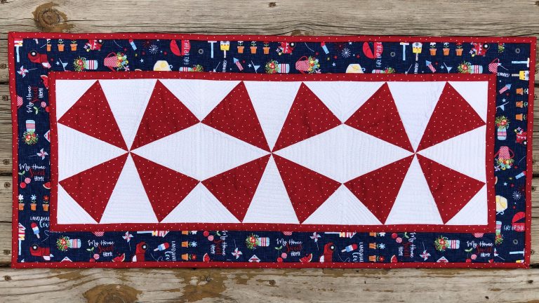
Quilt Artists Guide to Color Session 4: Texture, Print and Raising Surface
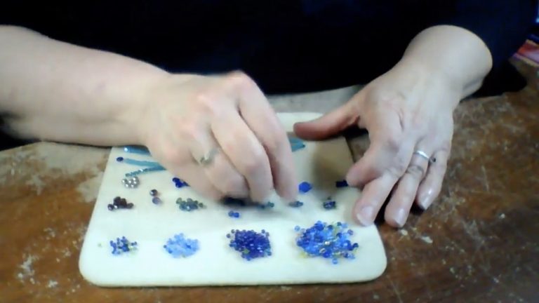
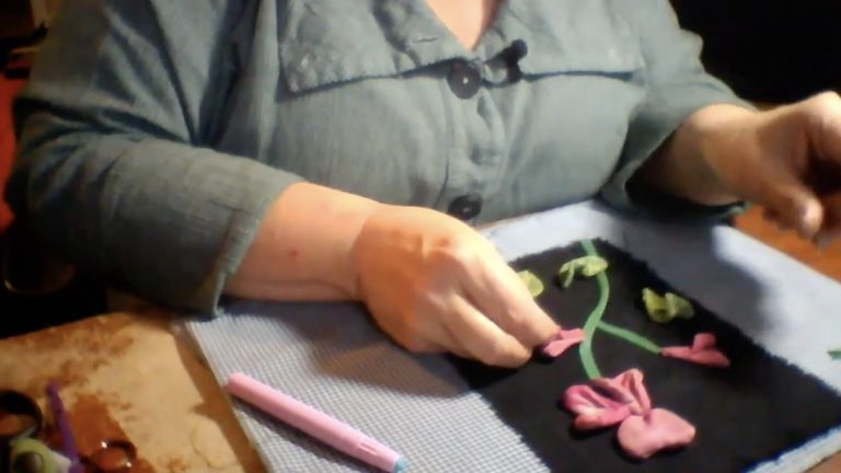
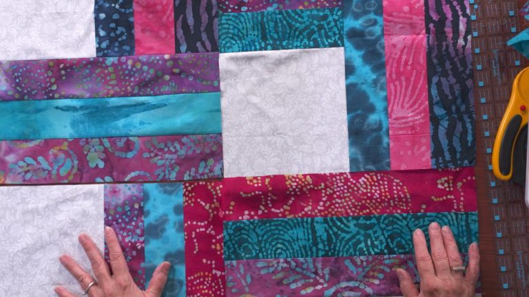
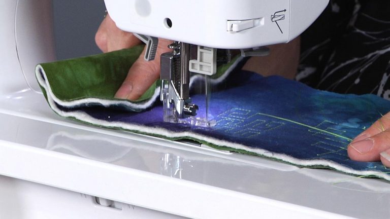
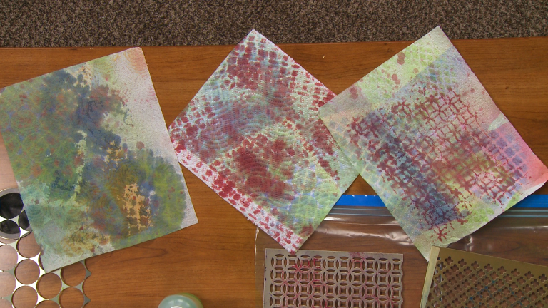
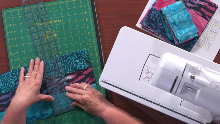
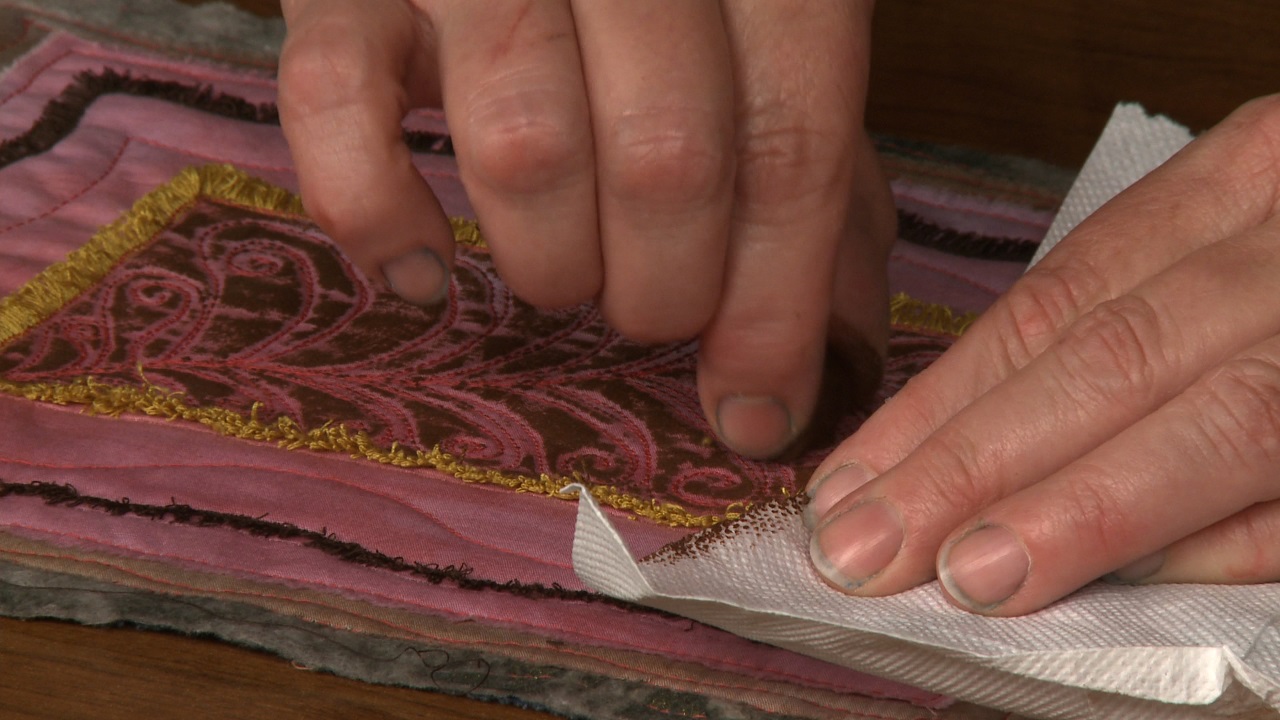
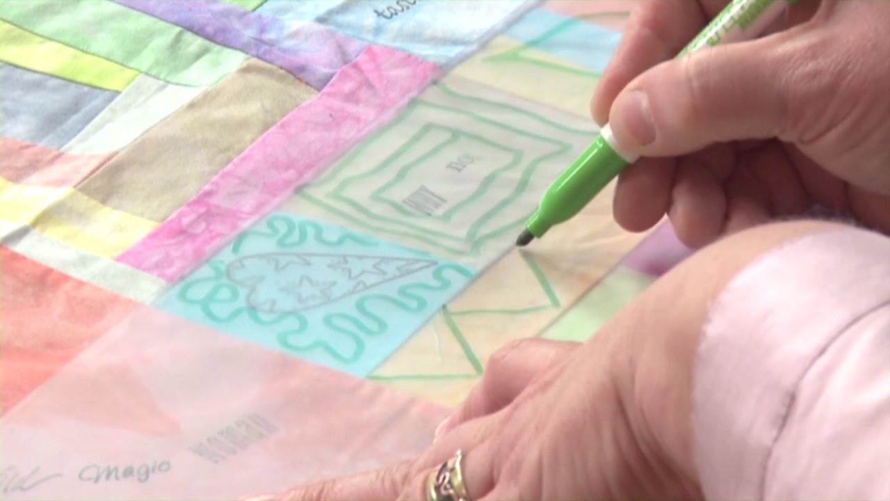
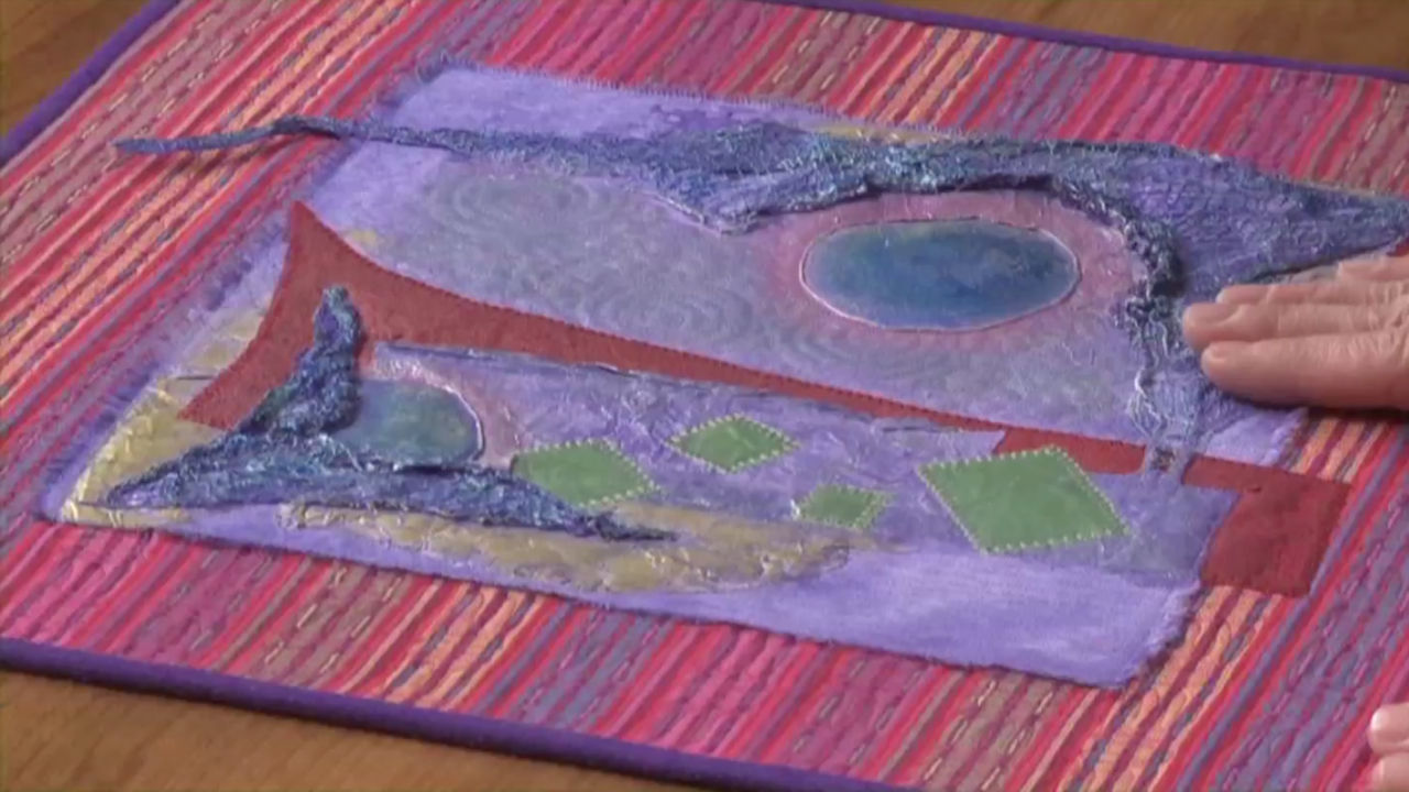
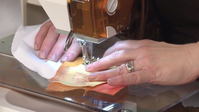
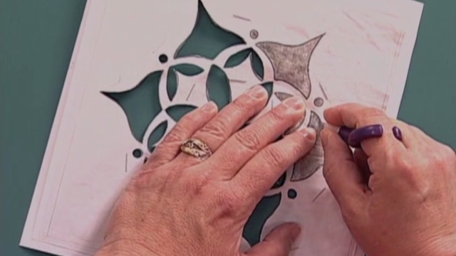
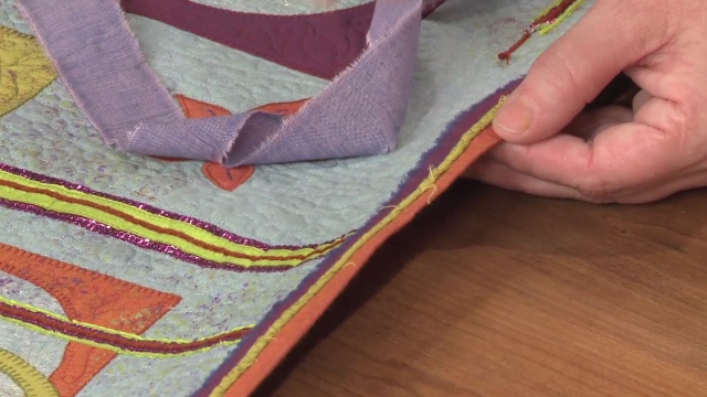
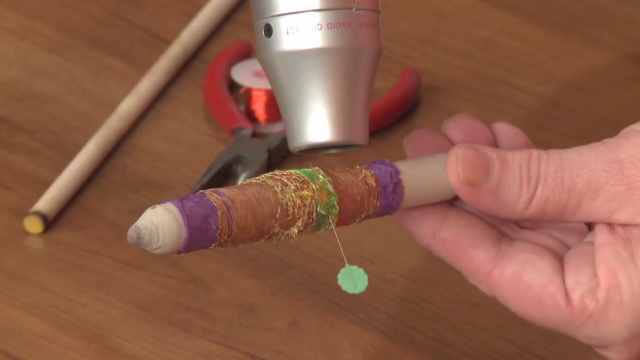
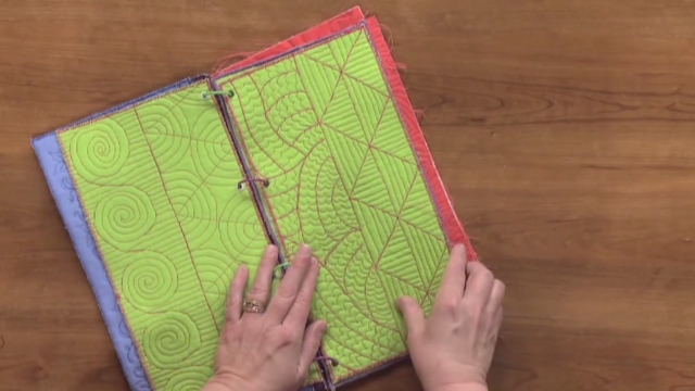
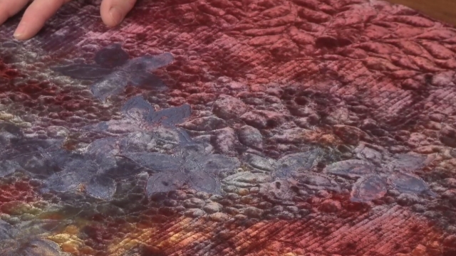
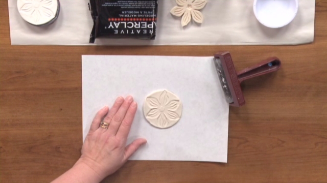
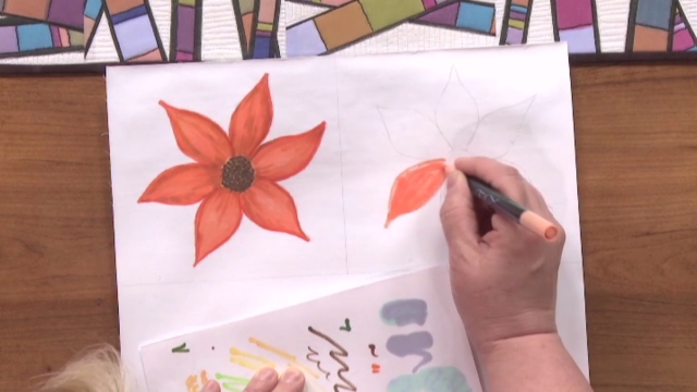
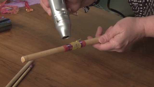
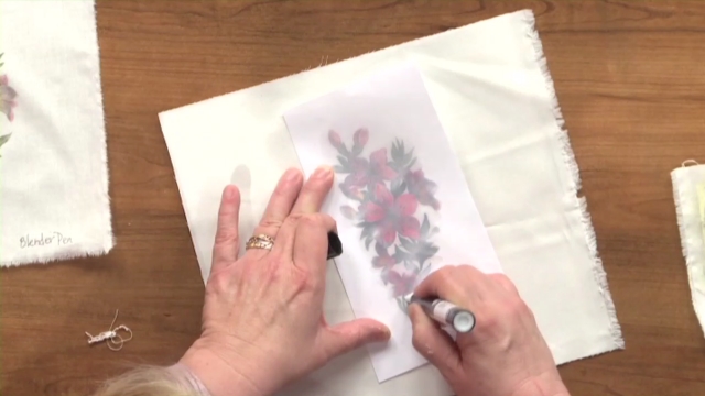
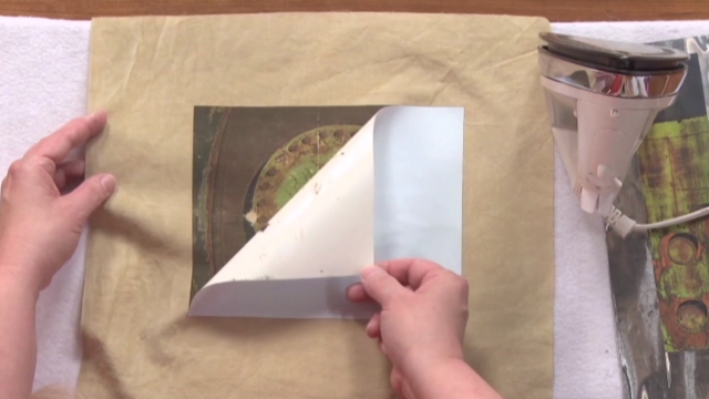
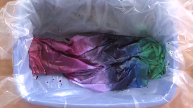
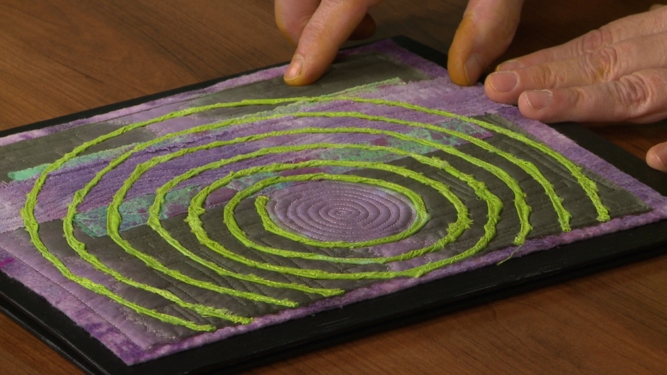
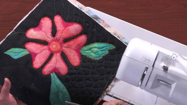
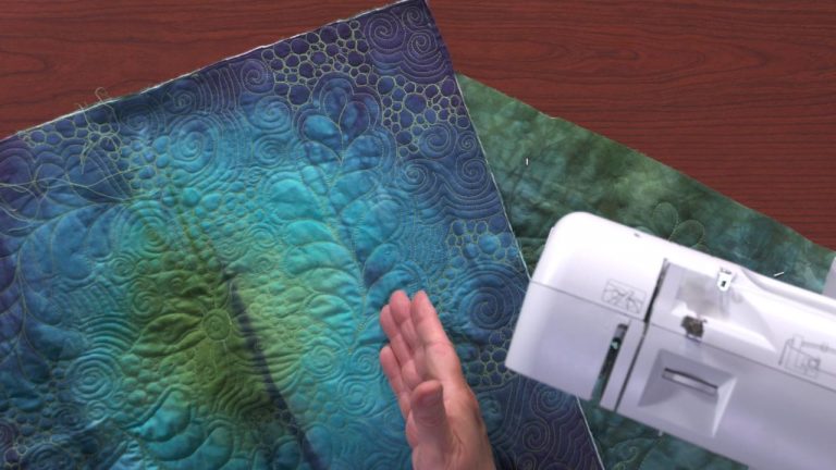
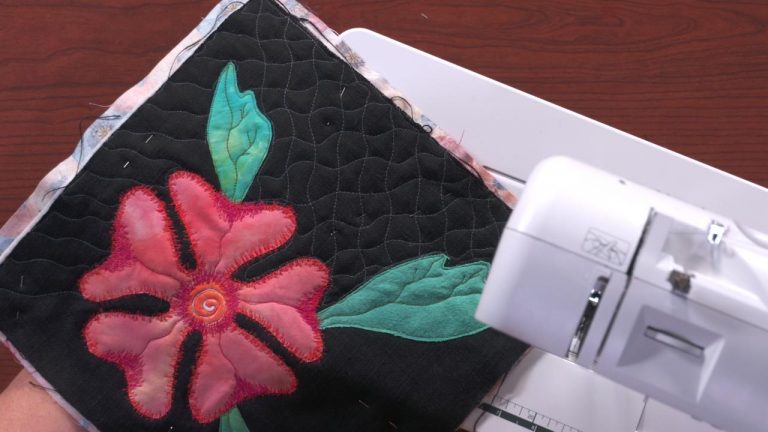
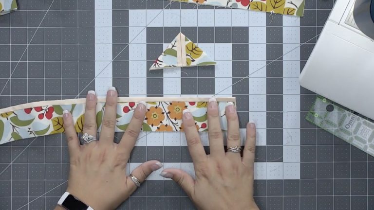
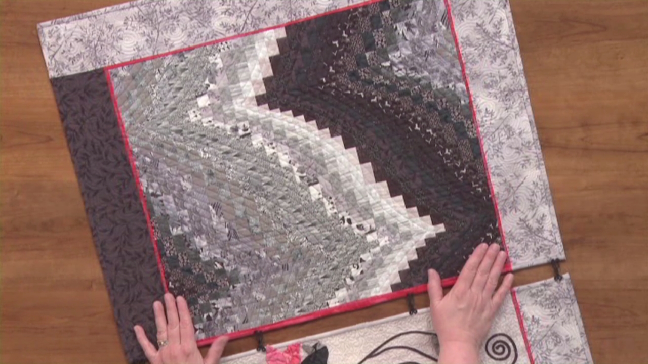
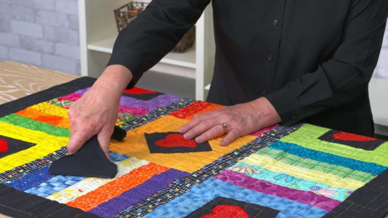
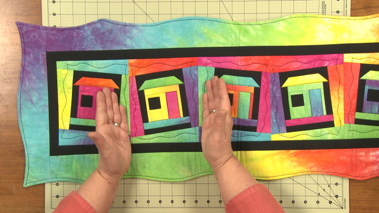
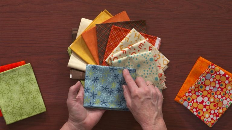
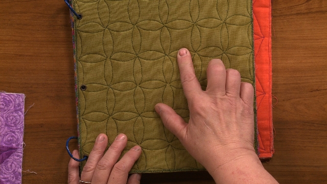
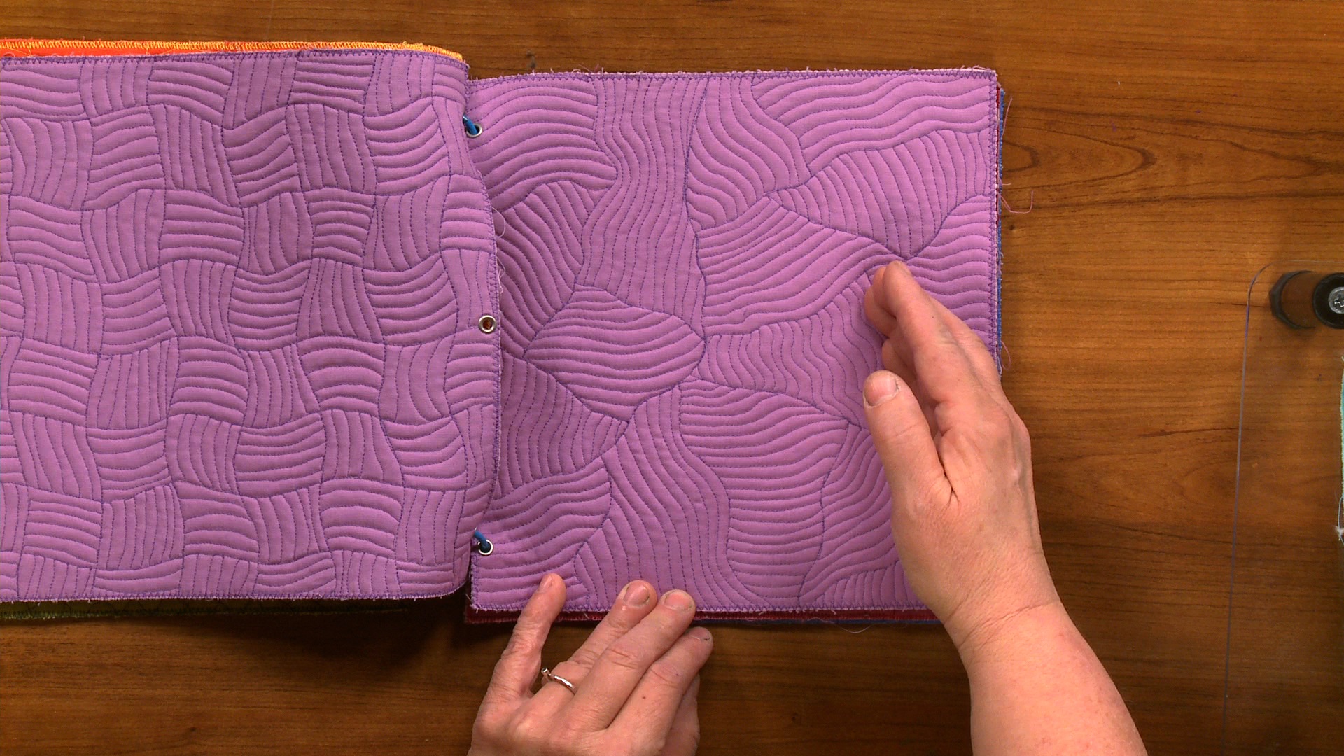
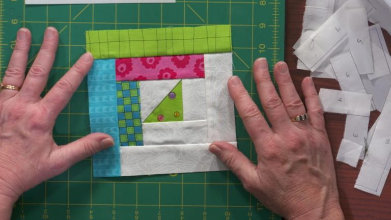
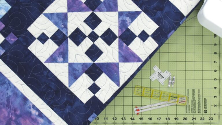
Heather ThomasThis session is all about visual and tactile texture and learning how to use them to create movement, rhythm, surface tension, dominance and so much more. Heather will help you understand how what is printed on the surface of a fabric or its visual texture, can affect the piece and in turn the viewer. She will guide you through a couple of exercises that will help you understand how the role of motif scale effects how a fabric occupies space and therefore influences design. She will then lead you into the exciting world of using fabrics and embellishments that have tactile texture so you can create a surface that begs to be touched.
Explore videos by Heather Thomas


You may be interested in
Premium Membership
Unlock exclusive member content from our industry experts.
- 24/7 Access to Premium Quilting Videos, Projects, and Tips
- Step-by-Step Instructional Demos, Patterns, and Tutorials
- 50% Off Video Downloads Purchased in the National Quilters Circle Shop
- Access to Ask the Expert Program
Unlock exclusive member content from our industry experts.
- 24/7 Access to Premium Quilting Videos, Projects, and Tips
- Step-by-Step Instructional Demos, Patterns, and Tutorials
- 2 Full-Length Video Downloads to Watch Offline
- 50% Off Video Downloads Purchased in the National Quilters Circle Shop
- Access to Ask the Expert Program
Gold Membership
$336 Value
Get everything included in Premium plus exclusive Gold Membership benefits.
- 24/7 Access to Premium Quilting Videos, Projects, and Tips
- Step-by-Step Instructional Demos, Patterns, and Tutorials
- 8 Full-Length Video Downloads to Watch Offline
- 3 Full-Length Quilting Classes to Keep for Life
- 2 Printable Quilting Guides
- Discounts on Purchase-to-Own Content in the National Quilters Circle Shop
- Access to Ask the Expert Program
- Exclusive GOLD LIVE Streaming Events
Share tips, start a discussion or ask one of our experts or other students a question.
Already a member? Sign in
No Responses to “Quilt Artists Guide to Color Session 4: Texture, Print and Raising Surface”