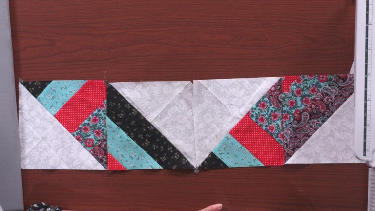
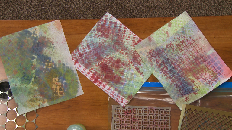
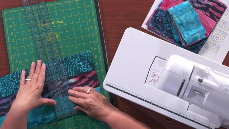
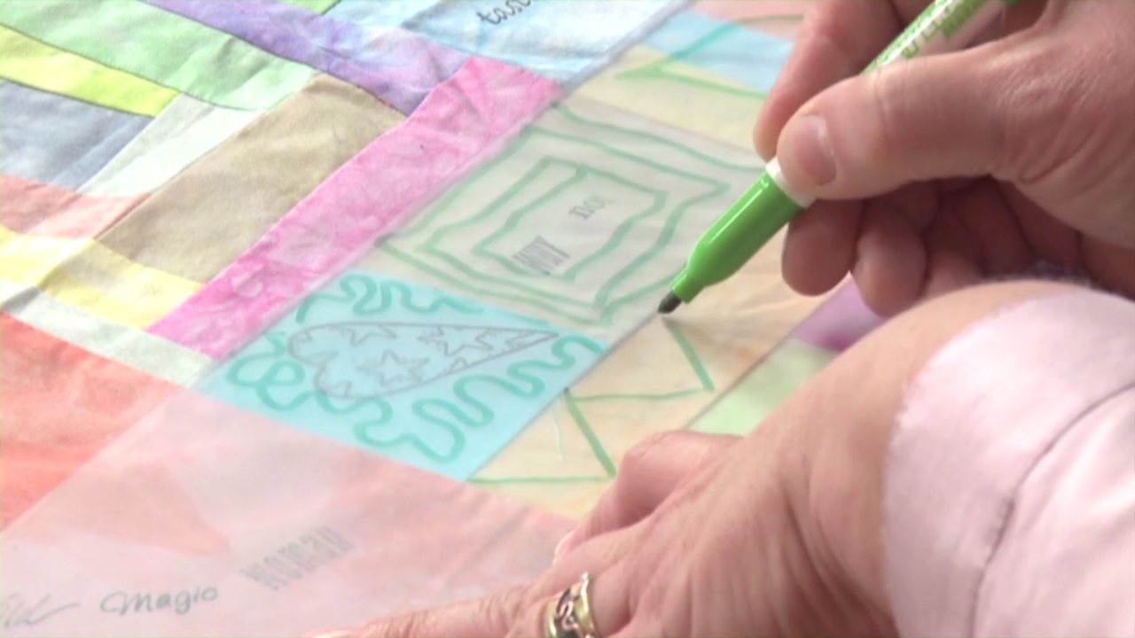
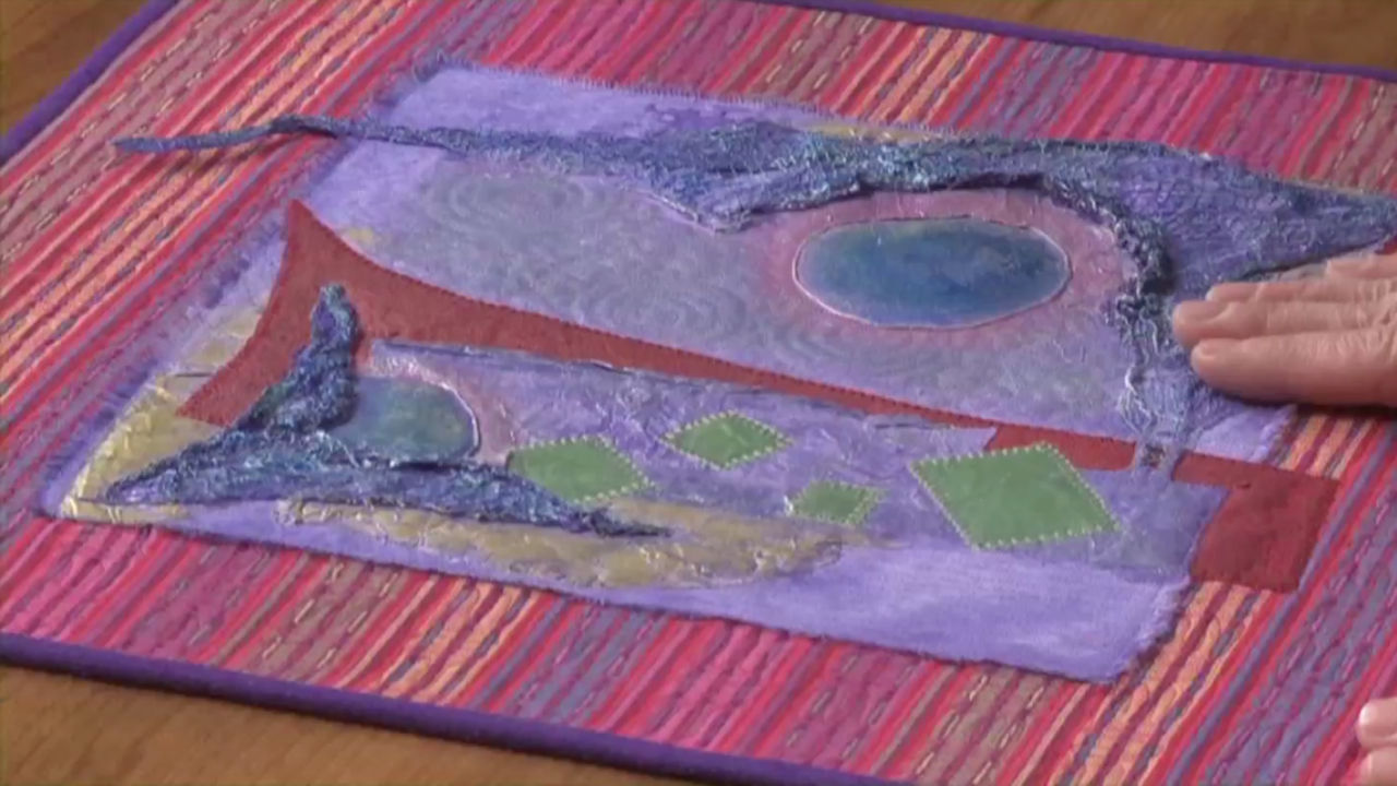
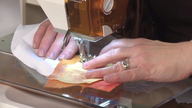
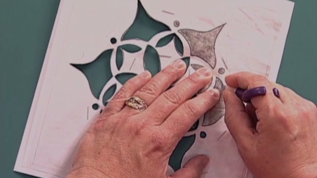
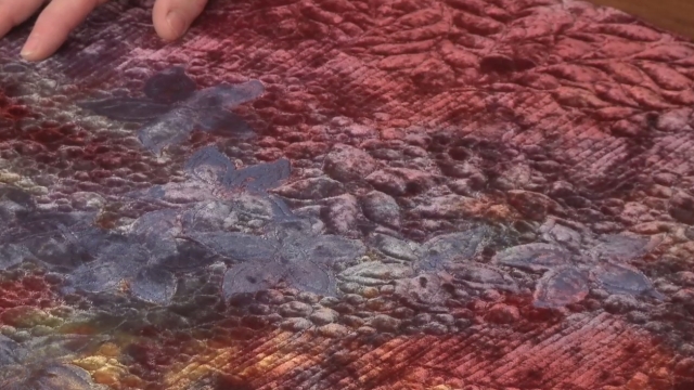
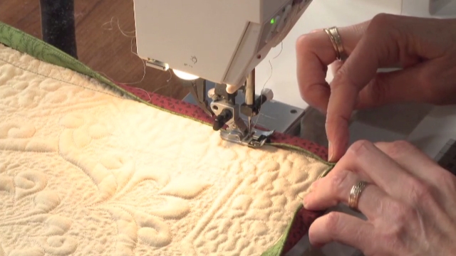
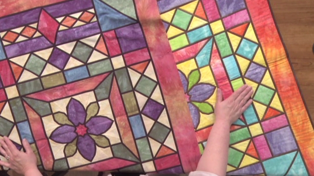
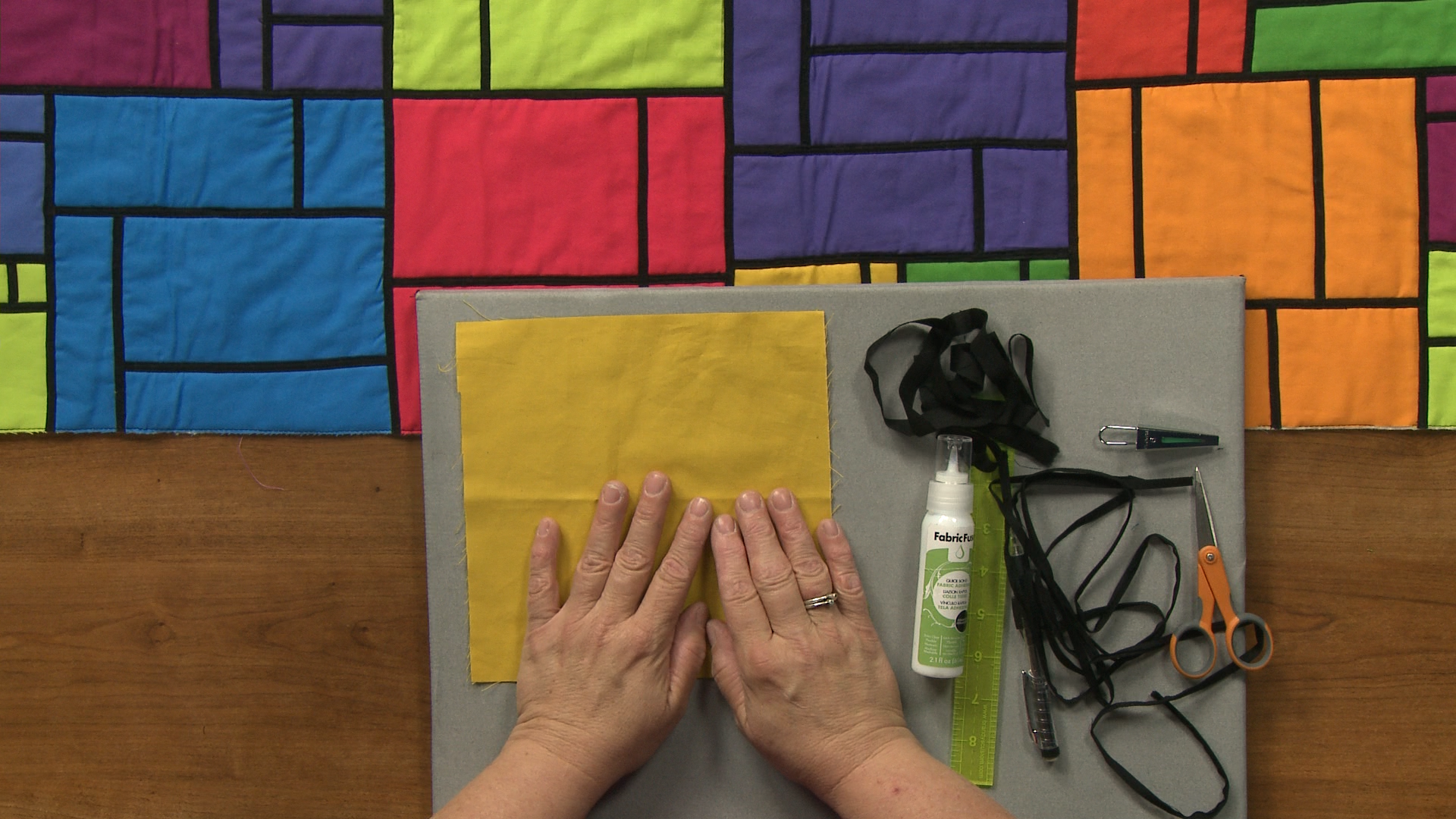
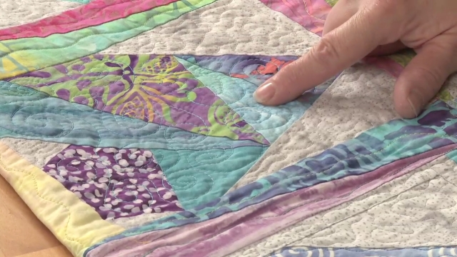
Interaction of Color with Quilt Fabrics
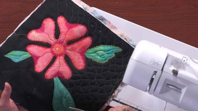
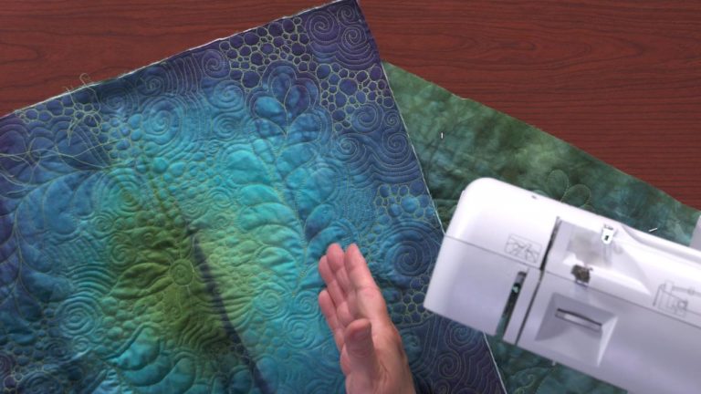
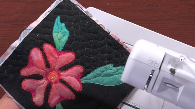
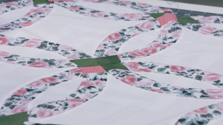
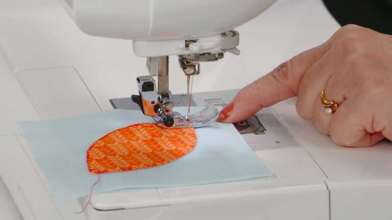
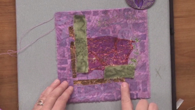
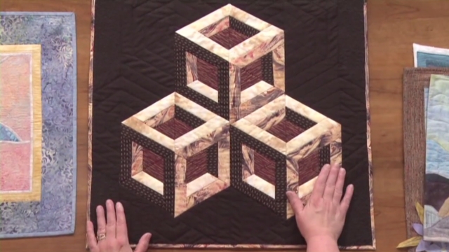
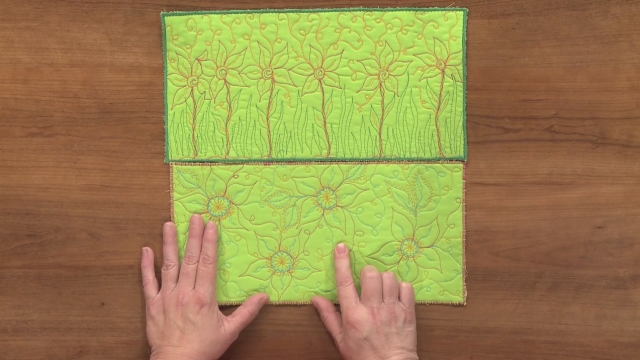
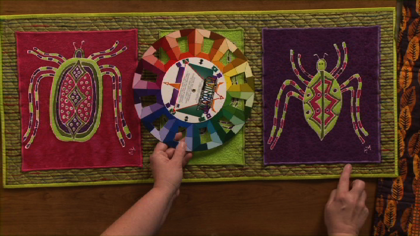
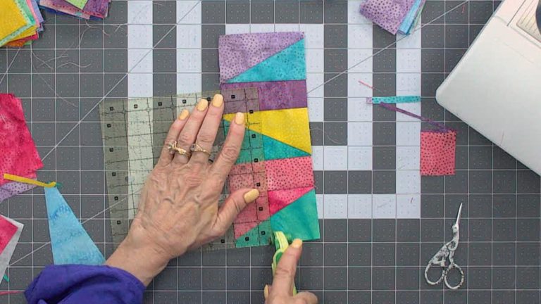
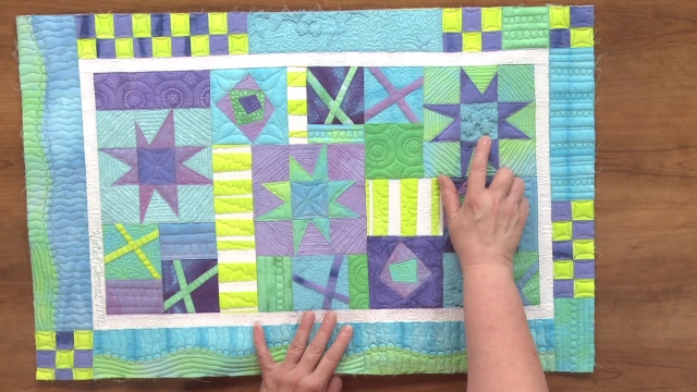
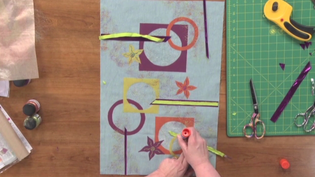
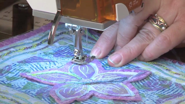
Heather ThomasHeather Thomas presents helpful techniques for determining what color fabrics to use when making your quilts. Learn how colors interact with each other and how to ensure the colors “make” your quilt rather than “break” your quilt. Find out how to utilize different colored shapes and fabrics without creating visual chaos. See what color interactions you enjoy and incorporate those techniques into your quilt.
Share tips, start a discussion or ask one of our experts or other students a question.
Already a member? Sign in
5 Responses to “Interaction of Color with Quilt Fabrics”
Explore videos by Heather Thomas


You may be interested in

Premium Membership
Unlock exclusive member content from our industry experts.
- 24/7 Access to Premium Quilting Videos, Projects, and Tips
- Step-by-Step Instructional Demos, Patterns, and Tutorials
- 50% Off Video Downloads Purchased in the National Quilters Circle Shop
- Access to Ask the Expert Program
Unlock exclusive member content from our industry experts.
- 24/7 Access to Premium Quilting Videos, Projects, and Tips
- Step-by-Step Instructional Demos, Patterns, and Tutorials
- 2 Full-Length Video Downloads to Watch Offline
- 50% Off Video Downloads Purchased in the National Quilters Circle Shop
- Access to Ask the Expert Program
Gold Membership
$336 Value
Get everything included in Premium plus exclusive Gold Membership benefits.
- 24/7 Access to Premium Quilting Videos, Projects, and Tips
- Step-by-Step Instructional Demos, Patterns, and Tutorials
- 8 Full-Length Video Downloads to Watch Offline
- 3 Full-Length Quilting Classes to Keep for Life
- 2 Printable Quilting Guides
- Discounts on Purchase-to-Own Content in the National Quilters Circle Shop
- Access to Ask the Expert Program
- Exclusive GOLD LIVE Streaming Events
Why did you want the central star pointed element to shine ?
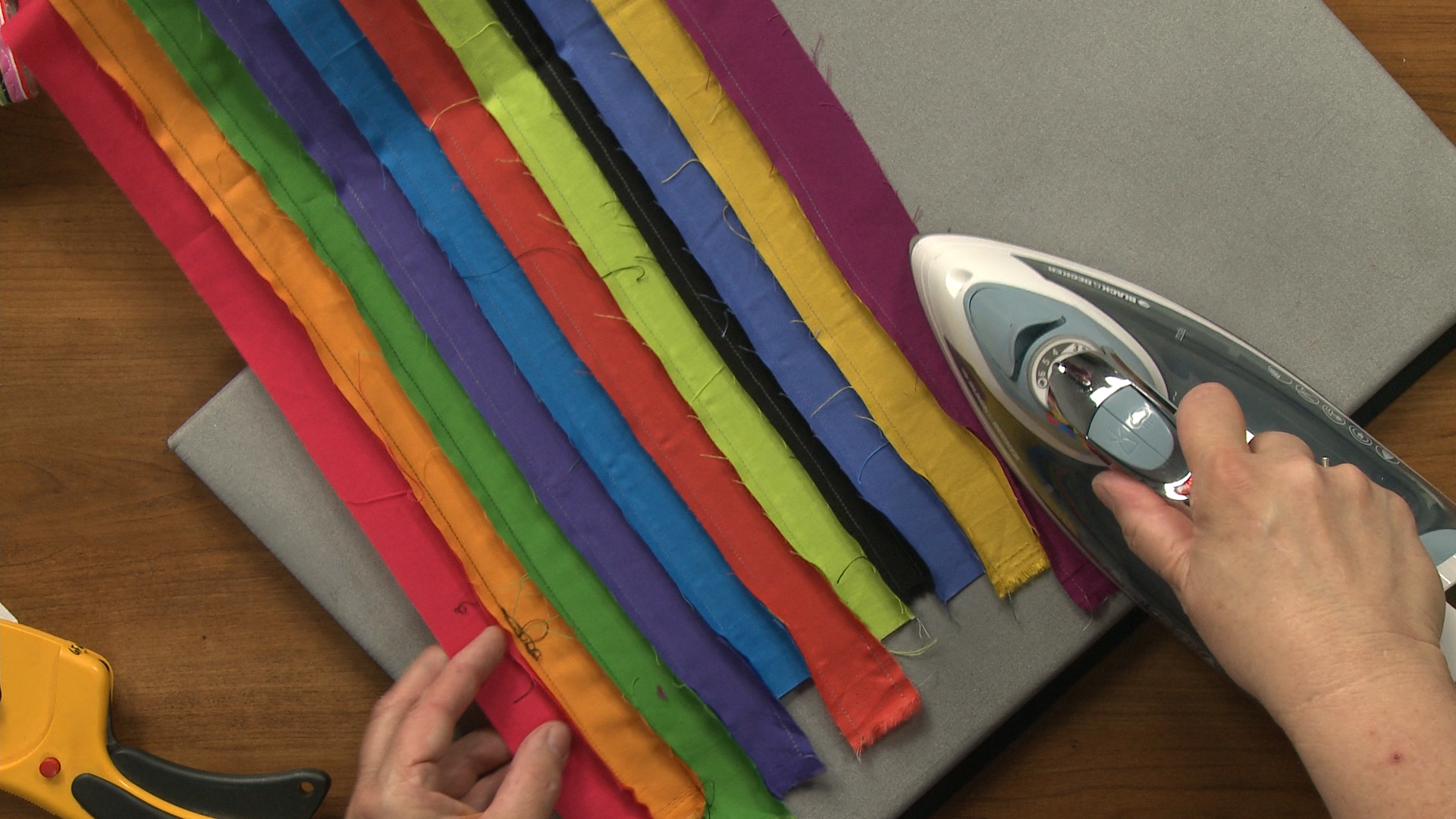
After watching this video regarding Interaction of Color with Quilt Fabrics, I have to say that I understand where you are coming from regarding contrast.l However, in your second example, the row quilts, I personally prefer the softer pallet of the first quilt you showed. It is more "pleasing" to the eye from the standpoint that the colors flow together, blend well and the accent colors give it interest. My eye has a place to focus and rest on the designs in this quilt. Therefore it is pleasing and attractive. My brain accepts the color combinations without feeling like the eye has to search for a focal point. The second row quilt has more "action" with the contrast in colors and my eye is searching for a focal point and cannot find a place to rest. The blend is too jumbled up for my personal taste. I have viewed many quilts done in a manner where the eye has no place to rest and no focal point of comfort and will soon get a headache looking at these types of designs. This is where my brain does not accept the design or color combination easily and eventually it becomes agitated. Therefore, I much prefer the blending versus the definitive contrast and color combination in some pallets.
Wow that explained a lot thank you Heather!
Wow!!! This was great, l loved the fact she has several different quilt tops to look at and compare.
This was very interesting tell the truth I liked all the variations