How do you choose colors for your quilts? In this five-part article series, quilter and writer Carole Fure analyzes the many factors that play in quilt color selection and offers practical tips for ensuring your quilts are well-balanced and appealing to the eye.
Color is the calling card of the quilt. It is the spark that catches our attention. If the color is appealing we will move in to take a closer look. However, if the color is unattractive, we walk on by, not noticing the creativity, design, and workmanship of the quilt.

I have made many quilts, some of which I did not like because of the colors I chose. A bigger problem was that I could not improve because I did not know what was wrong with the color selection. I know that I was not alone, as many quilters find color selection challenging. Color, however, is not some mysterious talent bestowed on some, while others are left lacking. Color skill can be learned with practice – it is a matter of training our eye. So let’s get started!
After some time studying color, I have identified two guiding principles to successful color selection in quilting. They are contrast and blending.
Principle #1: CONTRAST
Contrast is the relationship of light to dark and must be present for the design of the quilt to come forward. Think of it this way: If everything were light, we would be blinded by the light. And if everything were dark, we would be left in the dark. We need both the light and the dark to see.
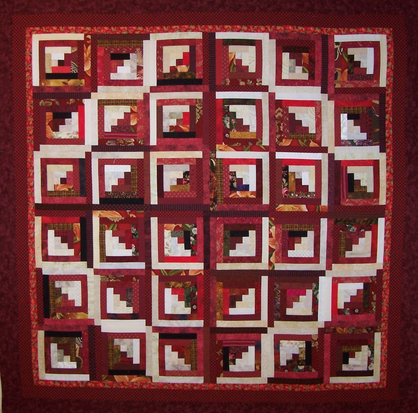
This quilt, called “Stepping Out,” demonstrates the use of high contrast between the white and the red which brings out a strong log cabin design.
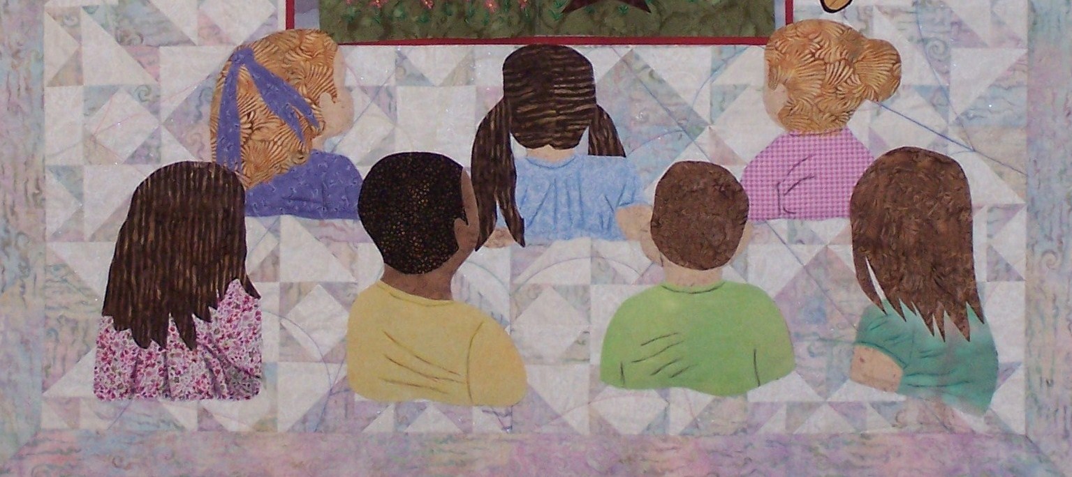
“Remembering Charlotte” features a low contrast Queen Charlotte’s Crown background of white and light pink fabric. It also features high contrast with darker figures placed on the light background.
Principle #2: BLENDING
Blending is the ability of colors to play well together. Our first lesson in blending is balance of color in all-color or multi-color quilts. Think of this multi-color quilt as a large dinner party where the personalities of our friends range from assertive to compliant. An appropriate balance of personalities will make a nice party, while an imbalance can be a rout or a remedy for insomnia.
Colors work the same way. Some are more assertive like yellow, while others are more passive like violet. The following is a rule of thumb for creating a balanced multi-color quilt:
• Yellow 8%
• Orange 11%
• Red 17%
• Green 17%
• Blue 22%
• Violet 25%
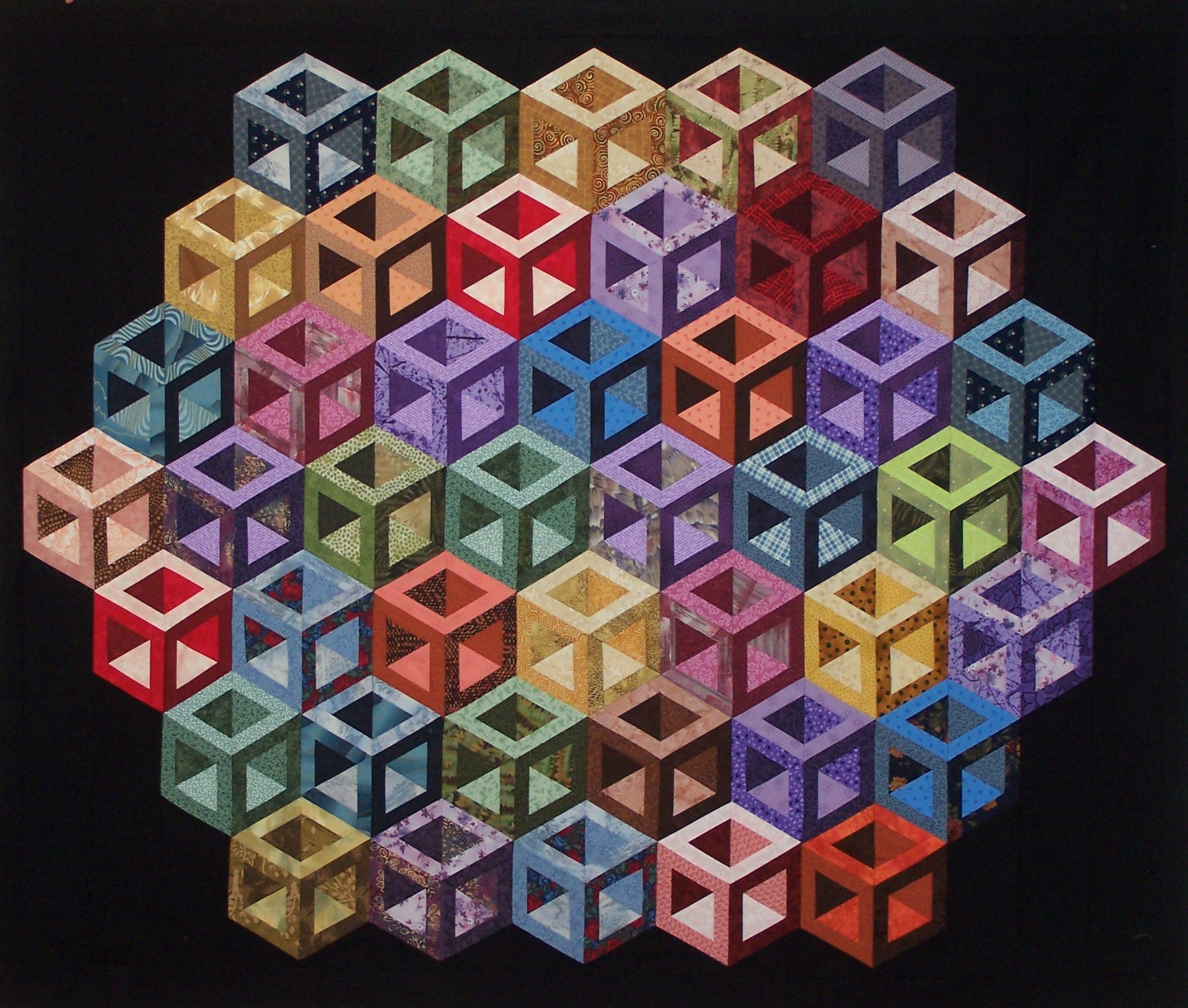
“Hollow Cubes” is an example of medium contrast. The use of light, medium, and dark fabrics creates the three-dimensional hollow cube effect. This all-color quilt also demonstrates the use of color balance with violet blocks out-numbering the yellow blocks.
Lesson: The more often you practice recognizing these qualities, the better trained your eye will become. Even if the answers seem obvious, continue to practice by asking the following questions:
• Does the quilt use high, medium or low contrast?
• Does the multi-color quilt use the principle of balance?
More in this Series:
Quilting Color Principles Part 2: Tint, Tone, and Shade
Quilting Color Principles Part 3: Common Color Schemes
Quilting Color Principles Part 4: Analogous Color Schemes
Quilting Color Principles Part 5: Complementary Color Schemes
Get in touch! Leave a comment or email editor@nationalquilterscircle.com.

Your rule of thumb for blending colors is interesting. How did you come up with that set of proportions?
Is it possible to purchase the Hollow Cubes Quilt Pattern?
Home quilter
Look forward to the information
I like how you explain everything
I really don't get much from NQC videos. They are to short and really don't give you the information you need. 2 or 3 minute videos on color theory are not what I need for picking colors for a quilt. I will not rep my membership and I think I will go with Crafts at least they show you step by step in a hour long video
Interesting
Please help me to chose colors for a quilt