How do you choose colors for your quilts? In this five-part article series, quilter and writer Carole Fure analyzes the many factors that play in quilt color selection and offers practical tips for ensuring your quilts are well-balanced and appealing to the eye.
A color, such as red, is not just a single color but has many variations. The chart below shows the relationship of these variations to each other.

In the upper left hand corner is the pure color, let’s say red. As you move down the left hand column, white is added to the red, lightening it. These color changes are known as tints of red, the lightest tint being at the bottom of the column.
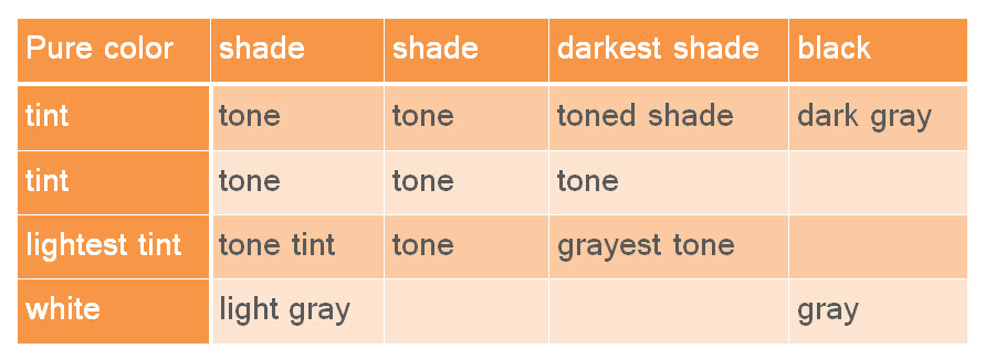
As you move across the top, black is added to the red, darkening it. These color changes are known as shades of red, the darkest being at the far right.
As you move diagonally from upper left to lower right, gray (mixture of black and white) is added to the red, dulling it. These changes are known as tones of red. The closer you move to the lower left the lighter the tone and the closer to the upper right the darker the tone.
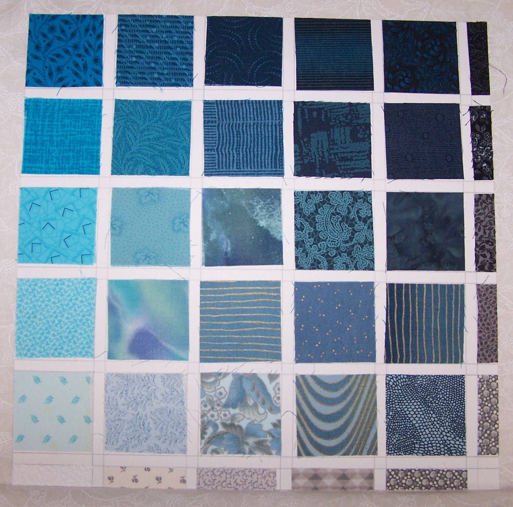
Pictured here is a blue/green color variation chart from my color study scrap book. Note how the pure color gets lighter as you move down the left hand side of the page, darker as you move across the top of the page, and duller as you move diagonally from upper left to lower right.
Now let’s go back to the dinner party analogy we discussed in Part 1.
Think of the variations of a single color as acquaintances. They know each other, but this does not make them friendly. For a stunning best friends quilt, the colors should run smoothly one to the other. This is known as a sequence of harmony. The following are examples of smooth color runs:
• Go down the left from pure color to lightest tint to white
• Go across the top from pure color to the darkest shade to black
• Go diagonally from pure color to grayest tone
• Go diagonally from lightest tint to darkest shade
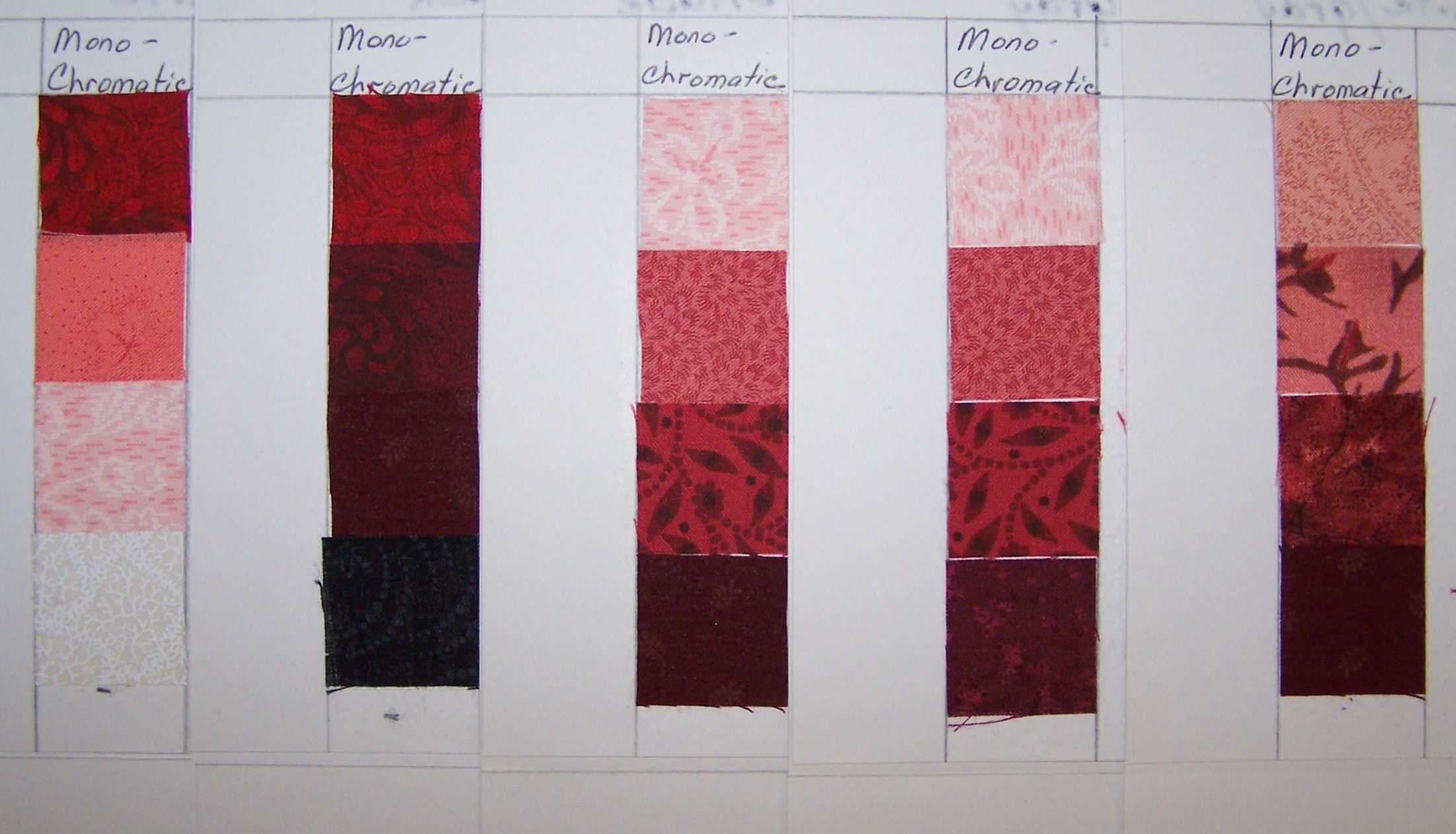
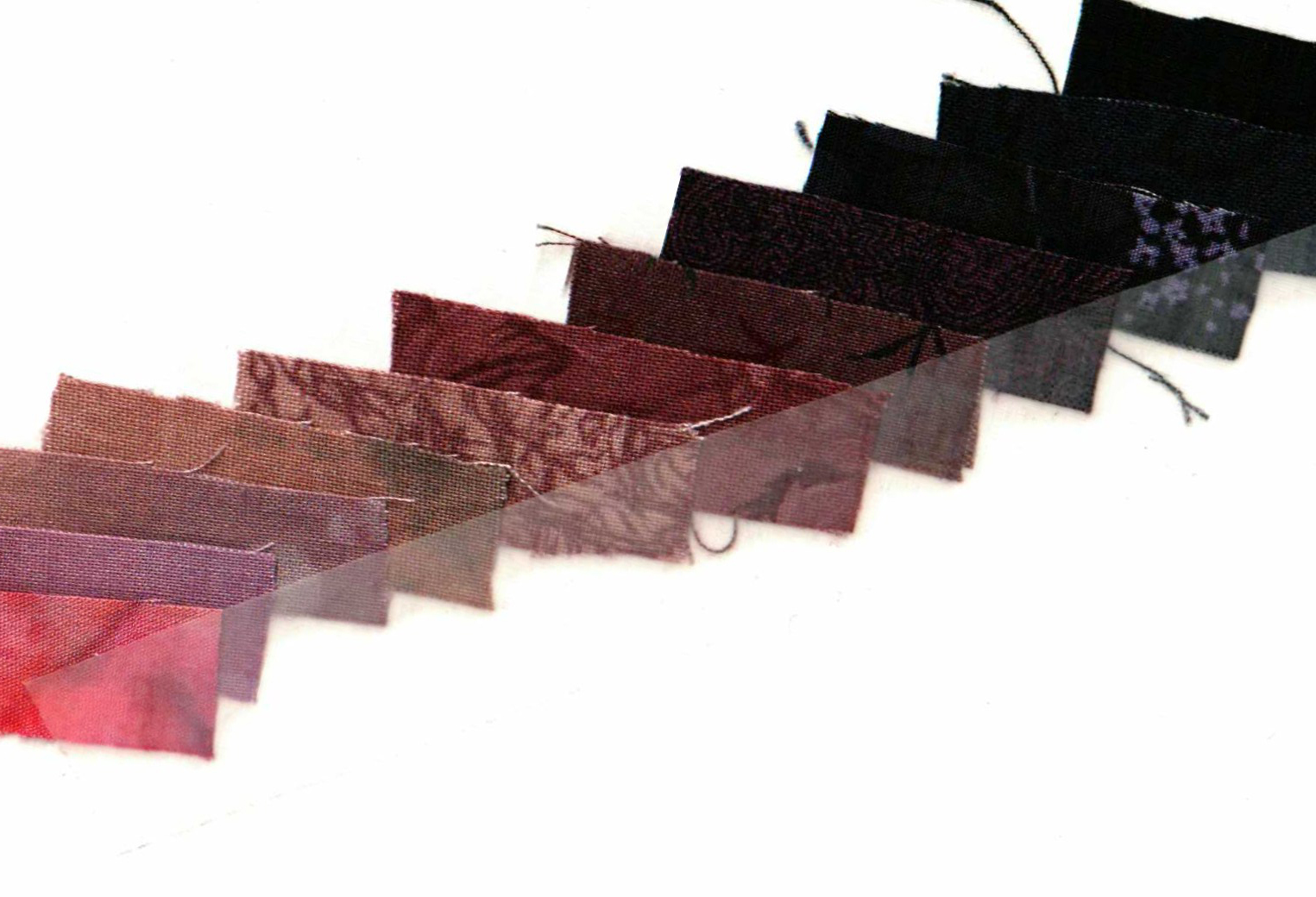
Here is a monochromatic red series from my color scrap book. These are subtle differences, but they can make the difference between an “okay” quilt and a WOW quilt.
• First column is pure red through tints to white (down left side of color chart)
• Second column is pure red through shades to black (across top of color chart)
• Third, fourth, and fifth columns are lightest tints of red through tones to darkest shade of red (diagonally from lower left to upper right of color chart)
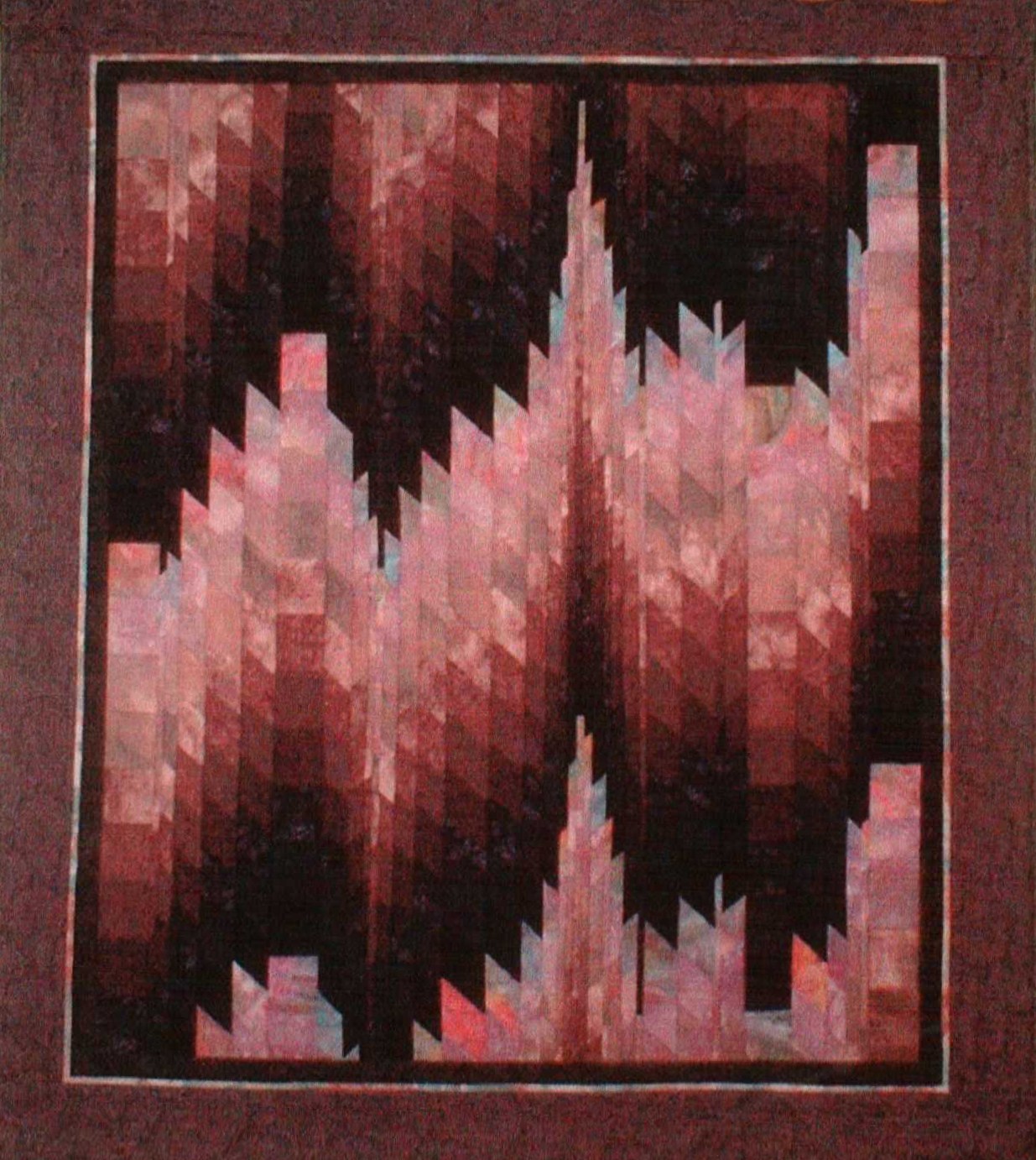
“Northern Lights” uses a tint, tone, and shade sequence in a monochromatic color scheme.
Here is a close-up of the color sequences of tint, tone, and shade used in “Northern Lights.” Note the smooth transition throughout the color sequence from light to dark.
Lesson: Try making your own color scrap book including pages for color variation study. This may seem like a lot of work now, but over time and with a little practice your eye will become trained to notice subtle differences in color.
How to make your own color variation charts:
• Pull out all your fabrics of a single color. Comparing one fabric to another, identify which is the most pure, which are tints, which are shades, and which are tones.
• Cut a 2-inch square from each fabric and mock up a color variation page following my photos as a guide. Are you missing some color variations to complete the sequence?
• Suggestion: Cut another 2-inch square to keep on hand for future color practices.
• Repeat the process through all twelve colors of the color wheel.
More in this Series:
Quilting Color Principles Part 1: Contrast and Blending
Quilting Color Principles Part 3: Common Color Schemes
Quilting Color Principles Part 4: Analogous Color Schemes
Quilting Color Principles Part 5: Complementary Color Schemes
Get in touch! Leave a comment or email editor@nationalquilterscircle.com.
Share tips, start a discussion or ask other students a question. If you have a question for an expert, please click here.
Already a member?

Ah, i need to build a color notebook to learn colors more deliberately. Thank you.
Such good explanation. I seriously need this. Thank you.
So love it.
Thank you so much for this article. Very clear explanation and demonstration of this color principal. Can’t wait to put it in to practice!!!
Like
This is very helpful. I look forward to more like this. Thank you.
That was helpful, thank you.
Thank you
This is great information about color