How do you choose colors for your quilts? In this five-part article series, quilter and writer Carole Fure analyzes the many factors that play in quilt color selection and offers practical tips for ensuring your quilts are well-balanced and appealing to the eye.

Complementary color schemes are the most sophisticated of the color schemes and also the most challenging. Using complementary colors without blending them can lead to a very strong, almost confrontational contrast. Blending the colors makes the quilt pleasant and chic.
Complementary color schemes require joining hands across the color wheel: red and green, violet and yellow, blue and orange. The same principles of blending and contrast as discussed before apply to make this color scheme work.
Let’s use red and green as an example of blending. To make red and green blend smoothly we must gradually change from red to green by adding a little green to the red and a little red to the green. When we do this each color gets a little duller and less defined until in the middle we have mud. Yes, mud! But mud works.
Blending can be done by dyeing fabric or by making fabric choices that gradually switch from one color to another. You could use a red fabric that has a small amount of green in it, another that has more, and so on, until you have a green fabric with a little bit of red in it. It doesn’t take much to make the transition. Even one or two fabrics that contain the middle mud colors will do the trick.
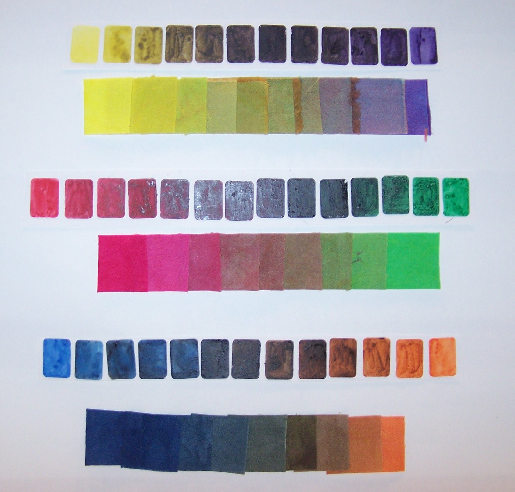
Pictured here are complementary runs of watercolor mixes and dyed fabric to show the range of colors. The top is yellow to violet, the middle is red to green, and the bottom is blue to orange. Do you see the muddy colors in the middle?
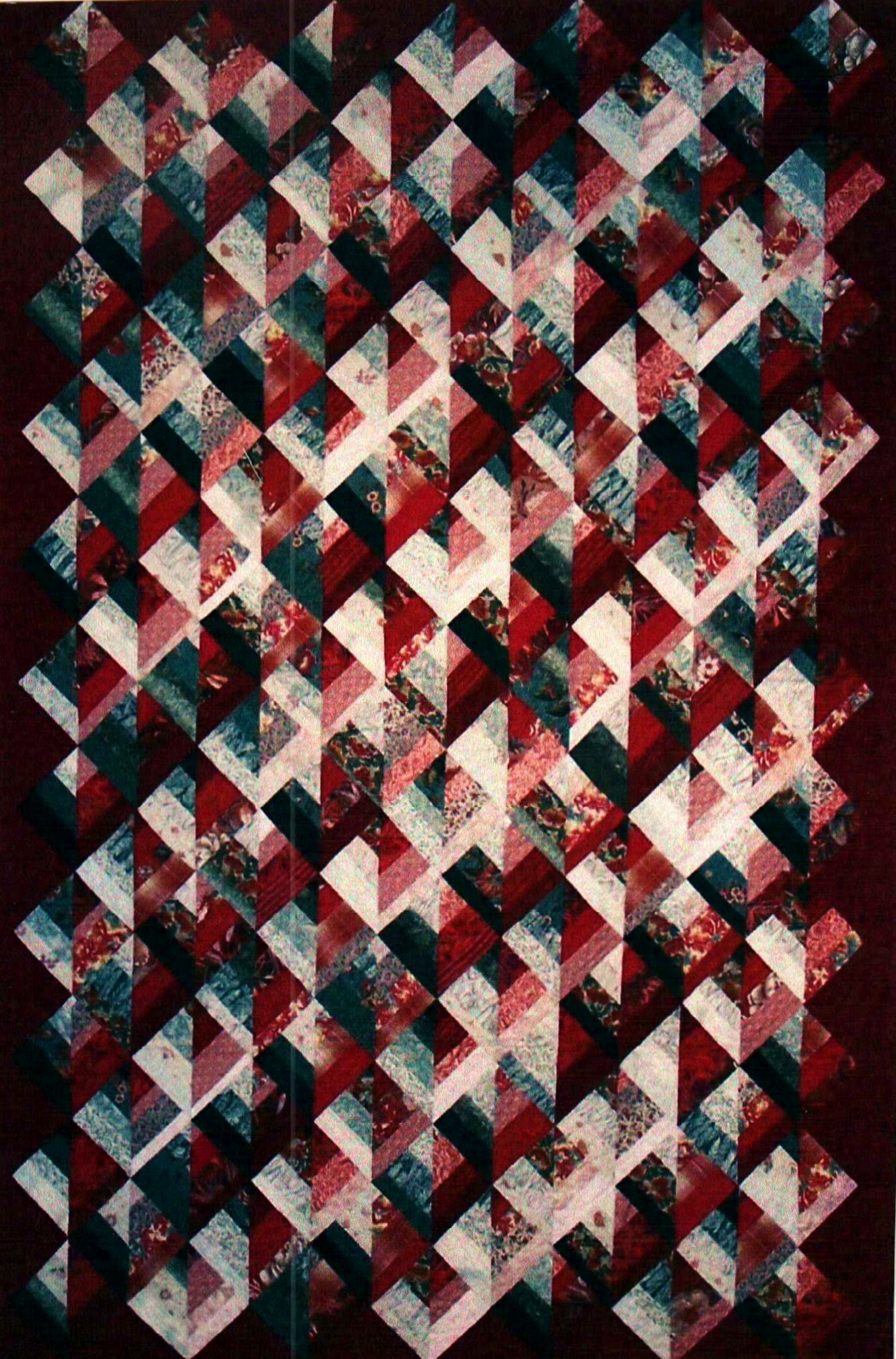
This “Color Study” quilt demonstrates the smooth transition of both a red and green sequence from tint to shade.
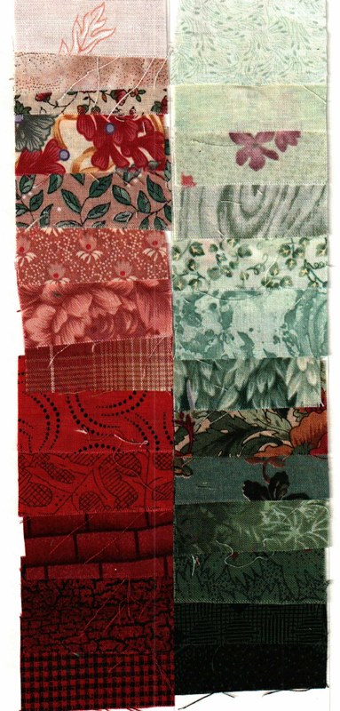
Here is a close-up of the fabrics used in “Color Study.” Note the incorporation of a little red in the green fabrics and a little green in the red fabrics.
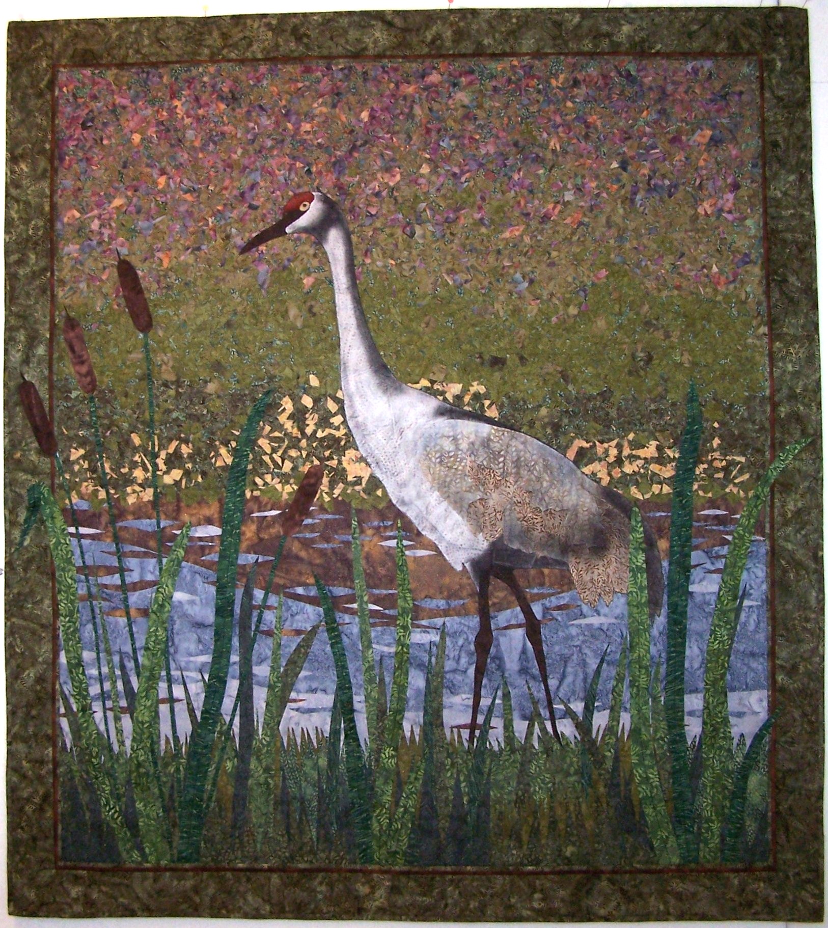
“Sand Hill Crane” uses the complements of red and green by blending them and mixing small pieces of each color. The quilt uses a tint-tone-shade sequence.
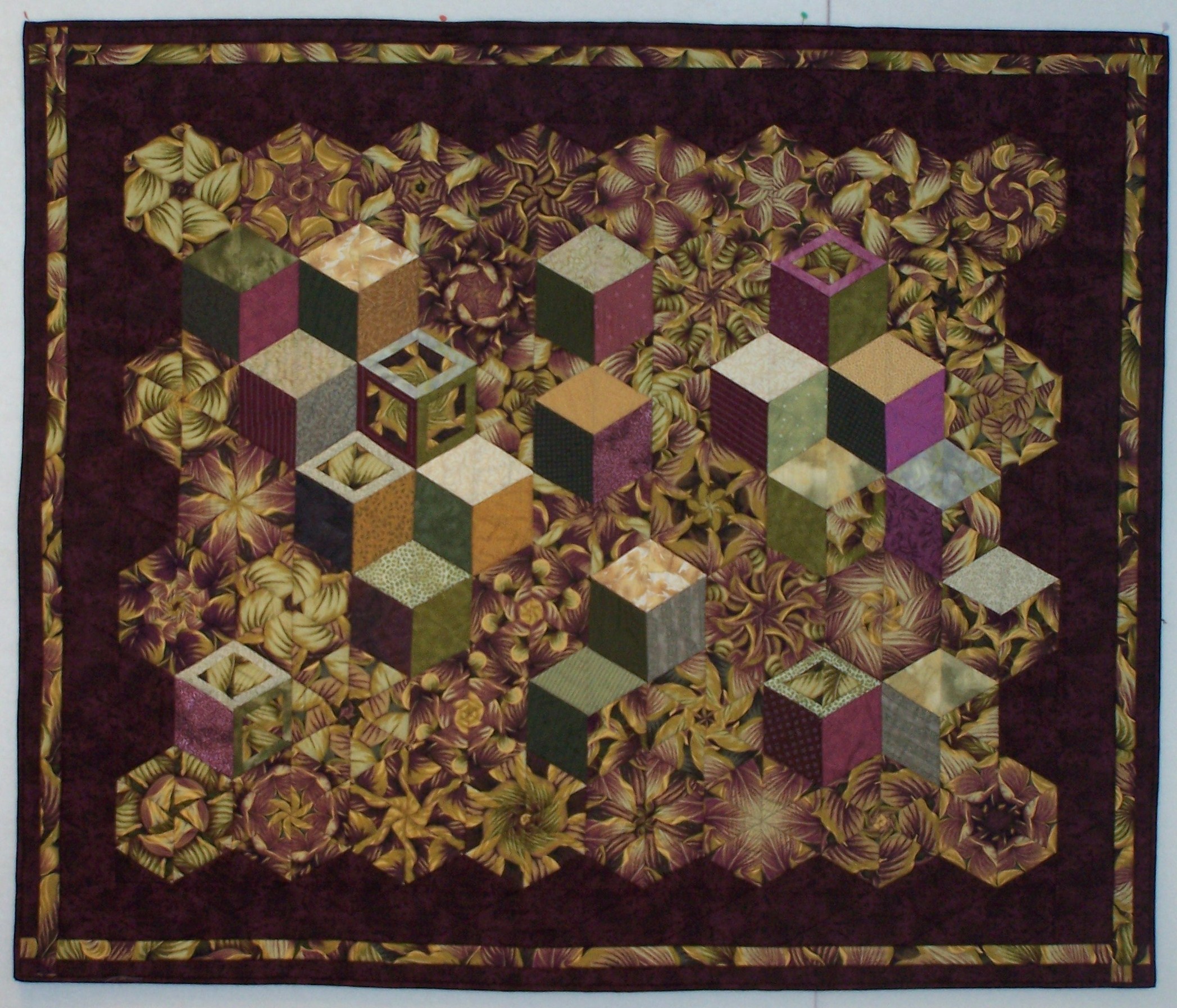
“Thinking Outside the Box” uses the complements of violet and yellow. Note the muddy green color in the quilt – this is the middle color when violet and yellow are mixed.
Lesson: The more often you work on recognizing these qualities the better trained your eye will become. Try the following as practice:</p
• From your stash identify complementary blending fabrics.
• Suggestion: Using your 2-inch practice squares, lay out a complementary color scheme using a smooth sequence of color. Are you missing some colors to complete the sequence?
This series of articles on color for quilts contains the basic principles you need to make color your best friend. Remember that training your eye to the subtleties of color takes time. It is better to practice a little bit at a time and often than to overwhelm your brain doing a lot only once.
Like friends, frequent contact through the lessons outlined in this series will deepen your color practice and make quilting an even more enjoyable – and colorful - experience.
More in this Series:Quilting Color Principles Part 1: Contrast and Blending
Quilting Color Principles Part 2: Tint, Tone, and Shade
Quilting Color Principles Part 3: Common Color Schemes
Quilting Color Principles Part 4: Analogous Color Schemes
Get in touch! Leave a comment or email editor@nationalquilterscircle.com.

Thanks for making more sense of this! Shopping for fabric to quilt can be overwhelming so this is very helpful!
Need to know about this. I am a new quilter. We had an elderly quilt member pass away. I got to see some of the material she had stored away. What a wonderful eye she had for color. I would like to have that same skill.
Truly enjoyed the entire five part series. Great help for a beginner like me. Thanks
I really enjoyed your lessons in Quilting color theory. I'm an experienced quilter and artist, but you simple concise lessons were just what I needed as I prepare to retire and make quilting my focus.
Thank you for this very useful advices, so clearly illustrated.
Very easy to understand!
I struggle with patterns in the materials. How do you decide what patterns will go with what?
I need to continue to understand color blending this will help
I very much appreciate the time and effort it took to produce this series on Quilting Color Principles. Helpful to see the swatches and color charts along with the examples quilts. Thank you.
Thank you so much for this series, very helpful to this new quilter struggling with colour use! I am sure this will help me achieve better results and, at least, have more confidence in my choices!