How do you choose colors for your quilts? In this five-part article series, quilter and writer Carole Fure analyzes the many factors that play in quilt color selection and offers practical tips for ensuring your quilts are well-balanced and appealing to the eye.

Remember color schemes work because the colors are friendly to each other. In the last two articles in this series we discussed two ways to make colors friendly: the use of balance
and the use of a sequence of harmony.
In this article we will look at several very common quilt color schemes that always seem to work. By examining them we can learn why and how they work so that we might use the principles in our own work.

We begin by stacking the color variation charts that we made in Part 2
for all colors one on top of each other, so that all the pure colors are directly under each other, and all the tints and shades of each color are also directly under each other. Pictured here are pages from my own color study scrap book.
Now if you were to take a pin and stick it down through the first page it would pierce the colors below in the same place on the color variation chart. The common relationship of these colors is their placement on the color variation chart.
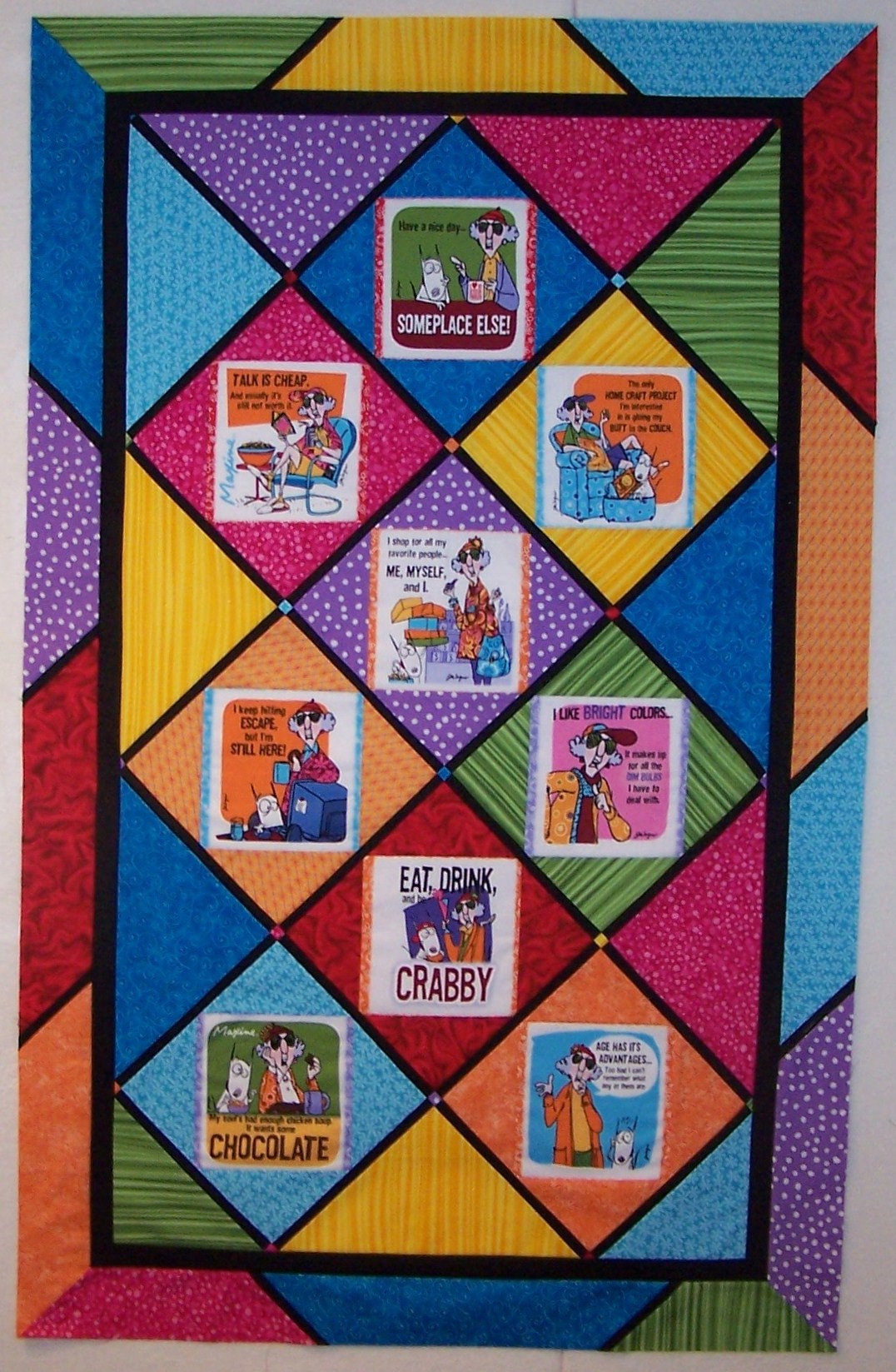
If you were to place the pin through the pure color square at the top left of the page it would pierce all the pure color squares of all the other color variation pages. This color scheme is often used in children’s quilts when strong pure primary colors are favored. Pictured here is a humorous “Maxine” quilt using strong pure colors.
If you were to place the pin through a tint square on the first page it would pierce the same tint square on all the other color variation pages. This scheme is often used in baby quilts when only pastels are used. “Feed Sack III” uses tinted reproduction fabrics against a gray background.
If you were to place the pin through a tone square on the first page it would pierce the same tone square on all the other color variation pages. This scheme is often used in making country style quilts where the maker is looking for a dulled-down or worn look. “Amish Sunday” uses tones to create a country style quilt.
The contrast in these quilts comes from the colors themselves. Yellow being a lightest color serves as the light while blue being the darkest serves as the dark. All the other colors fall in between, creating a wide variety of medium values.
• Identify quilts that use a common primary color scheme.
• Identify quilts that use a common tint color scheme.
• Identify quilts that use a common tone color scheme.
• Suggestion: Using your 2-inch practice squares, lay out a primary color scheme, a tint color scheme, and a tone color scheme.
More in this Series:
Quilting Color Principles Part 1: Contrast and Blending
Quilting Color Principles Part 2: Tint, Tone, and Shade
Quilting Color Principles Part 4: Analogous Color Schemes
Quilting Color Principles Part 5: Complementary Color Schemes
Get in touch! Leave a comment or email editor@nationalquilterscircle.com.
In our personal challenge quilting group , Cirque du Fabrique, I have randomly chosen a three analogous wit one complementary color scheme. Are the color progression charts featured in lesson three available for purchase? If so, please advise me regarding the source. Thank you for offering these informative color lessons.
I am a fitst time quilter. I have made clothing for many years.