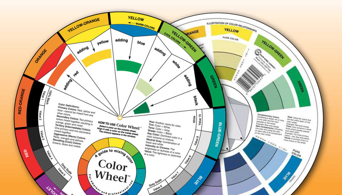
One of the most important elements of quilt composition is color. Color choices can make or break a quilt, and it is sometimes difficult to select a color scheme that works for you. If you’re struggling to choose colors, or are unsure of what kinds of combinations will best accentuate your quilt, we suggest you try using a color wheel! A color wheel is a great tool for quilters to visually organize color relationships in a simple way.

Related video: How to Use a Color Wheel for Quilting
Different Types of Color
The quilter’s color wheel (which you can see in this video) illustrates four variations of colors. On the outer ring, you have what is called a pure hue. Sometimes referred to as “root colors”, pure hues are the 12 most intense forms of color. Every color, including black, is made of some variation of a pure hue. There are three types of pure hues:
Primary Colors
- Red
- Yellow
- Blue
Secondary Colors (a mixture of two primary colors)
- Green
- Orange
- Purple
Tertiary Colors (a mixture of a primary and secondary colors)
- Yellow-Orange
- Yellow-Green
- Blue-Green
- Blue-Violet
- Red-Violet
- Red-Orange
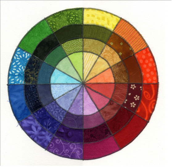 On the second ring are shades. Shades are pure hues, with a bit of black added. These dark colors are less intense than the pure hue, but are still very eye catching. The third ring of this color wheel is tones. Tones are the most muted form of color, and are created when a pure hue is combined with grey. Tones are thought to be subtle yet complex, and are easy to look at.
Lastly, the inner ring of this color wheel holds tints. Tints are a pure hue mixed with white. Sometimes referred to as pastels, these colors are soft and bright, but still less intense than a pure hue.
How to Use Color Variation in Your Quilts
By utilizing every ring of the color wheel, you can create a more visually interesting quilt than if you had been only working with pure hues. It may be easy to think of different color combinations for your quilt, but when you also think about combining different tints, tones, and shades of those colors you can bring your quilt to the next level!
Let’s look at some examples of how these colors look together. Complementary color schemes are sophisticated and intense. This makes them a bit challenging to pull off. Complementary colors are two colors that sit across from each other on the color wheel (red/green, purple/yellow, orange/blue). When pure hues of complementary colors are used together, they create a strong and somewhat unpleasant contrast. To make them work better together, you can blend them by using tints, tones, and shades. This makes a more gradual transition between hues, and an overall more visually complex color scheme. When done correctly, complementary colors can make some of the most sophisticated and beautiful quilts!
An easier combination of colors to use is an analogous color scheme. Analogous colors are three colors grouped next to each other on the wheel. Together, they are incredibly attractive and harmonious. This is because the colors on the wheel all contain a little bit of color from their neighbors. For example, yellow-green, yellow, and yellow-orange, all contain yellow. They naturally work well together! Together, analogous colors make nice gradients with high contrasts when you use tints, tones, and shades.
These are only two examples of the infinite color combinations you can make when using a color wheel. But when you have a basic understanding of color, and they many variations of it, you can apply the same rules to many different combinations. The possibilities are truly endless!
To learn more about the color wheel and how to apply it to your quilts, check out these videos:
Using a Color Wheel to Choose Quilt Colors
Defining Color Personalities with Grayscale and Quilting Color Wheel
Have something to add? Leave a comment or email editor@nationalquilterscircle.com.
how can you use the color wheel if colorblind?
Want to learn how to put colors together that give meaning to the quilt.
Help for the color changes who want to make beautiful quilts